Your homepage is probably the page you’ve agonised over the most, and you’ve only got a short amount of time to make the right first impression.
A homepage that dumps everything on a visitor at once, or leads with the wrong thing at the wrong moment, doesn’t give people a reason to stay.
Keep reading because I’m going to go through exactly what your website homepage design is missing, and the exact sections you need to include to convert your audience into clients.
You only get one chance at a first impression
I’ve worked with a lot of photographers who feel like their website just isn’t working, but can’t put their finger on why. Their work is good and their pricing is fair for their skills and experience, but the enquiries aren’t coming.
Nine times out of ten, the homepage is where things are falling apart.
And it happens faster than most people realise. According to Google’s research, visitors form an opinion about your website in 0.05 seconds {data by kinesisinc.com}, and Stanford University research found that 75% of those judgements are based entirely on design {data by kinesisinc.com}.
Before someone has read a single word of your copy, they’ve already decided whether they trust you and whether they want to stay on your site.
And that’s really important for a wedding photographer.
Couples are trusting you with one of the most important days of their lives, and they’re not going to give a second chance to a photographer with a website that doesn’t immediately feel right.
Most of the time it’s not about talent, but it’s about how you communicate that talent and help your audience see themselves in your work before they click through to your other pages.
The right sections, in the right order, with the right things in them, change the outcome completely and creates a client journey they can follow.
But without it? Confusion. And when a website visitor is confused, they leave.
And instead of booking you, they book another photographer instead. Which is a shame because not only will you lose the sale, but they’ll miss out on booking an amazing photographer like you.
So use your homepage wisely to make sure you’re showing your photography business in its best light, and connecting and leading your dream clients to book.
Every visitor arrives with the same four questions
When someone lands on your homepage, they’re not just browsing with an open mind. They’re looking for specific answers:
- Am I in the right place?
- Can I trust this person?
- Do they understand me and what I’m looking for?
- What should I do next?
And they’re moving through your page looking for those answers, fast.
A well-structured homepage answers those questions. A poorly structured one leaves people guessing, and as you now know, when people are guessing, they leave.
This is the part most photographers get wrong—I see a lot of DIY photography websites that are nearly empty: one large hero image, or maybe a gallery, and that’s pretty much it. No introduction, no context, no direction.
Then a potential client finds your website and has no idea who you are, what you do, whether you’re based near them, or what they should do next.
Beautiful images aren’t enough on their own. And I know you want to “let your work do the talking,” but when couples are booking a photographer for one of the most important days of their life {a day some of them have been dreaming about since they were little} a stunning gallery isn’t enough to make them enquire.
They need to trust you. They need to connect with you. And that doesn’t just come from images.
Your homepage needs to create a journey. Think of it as an overview of the most important parts of your website—the sections that build trust, show your work, and guide someone toward enquiring.
It should welcome them, connect with them, give them a feel for what you offer and who you are, and point them somewhere specific.
But be careful here—you don’t need to show them everything. It doesn’t need every package, every gallery, every page you’ve ever built. Just the most important things, in the right order, with a clear path forward.
Most people scan websites
Research shows that only around 20% of page content actually gets read. People move through websites in F-shaped or Z-shaped patterns, making split-second decisions about what deserves their attention based on visual hierarchy, not copy. Around 70% of the actions someone takes on a page happen because of visual cues, not text {data by cxl.com}.
Visitors aren’t lazy when they do this, they’re overwhelmed. Think about how many photographers there are for them to look through to find the perfect match for them {because there are more photographers than ever before, so make sure you stand out for the right reasons}.
They’re filtering constantly, and your page needs to signal that it’s worth their time before they’ve decided to give it any.
The mistake I see most often is photographers writing long, detailed copy for every section, thinking more information builds more trust. It doesn’t, it just gives visitors more to skip.
On a photography website homepage:
- Visual hierarchy matters more than copy volume
- Spacing matters more than filling every inch of the page
- CTAs need to be obvious, not decorative
- Headlines need to communicate value the moment someone’s eyes land on them.
- And your fonts need to be legible and clear
Getting this right has a measurable impact on your bookings. Clear page structure can increase conversions by up to 200% {data by highervisibility.com}, and reducing the number of choices on a page can improve conversions by up to 30% {data by wisernotify.com}.
Good design guides attention, as long as it’s done purposefully.
Keep your navigation simple
Before we get into the sections themselves, we need to talk about navigation because it shapes the whole experience before anyone scrolls.
Your navigation is the first place many visitors look when they land on your page, and it needs to do one thing well: show people where to go {it’s the foundation for your client journey}.
Keep it to around six links maximum. A lot of photographers include every page—blog, about, galleries, pricing, contact, FAQ, investment, and more—and end up with a navigation bar that feels like a menu with too many specials.
And if people don’t know where to start, they often don’t.
When I was a photographer, I started with eight links in my navigation. Eight! There was no clear path, no direction, just options everywhere.
Because people are busy, and my navigation? Overwhelming.
People want quick answers and a clear flow.
Simplifying it down was a small and easy change but it made one of the biggest differences.
Think of your navigation as mapping out the client journey before they even start, guiding someone from “I’ve just landed here” all the way through to “I’m ready to enquire,” without them having to figure out the route themselves.
Every link should earn its place. If a potential client doesn’t genuinely need it before they decide to book, it probably doesn’t belong there. Keep it purposeful, and make sure getting in touch is always easy to find.
{Oh and bonus tip: While we’re on the subject of client journey, remember that every page of your website should have one clear call to action at the end. Never leave your audience to guess what to do next. Make it easy for them to book you! I know this isn’t necessarily homepage related, but I couldn’t talk about client journeys and not mention this.}
The sections every wedding photographer’s homepage needs
Below is the homepage structure I build into every photographer website I create. Each section has a job, and the order they appear in is deliberate.
I’ve also included some website examples so you can see them in action.
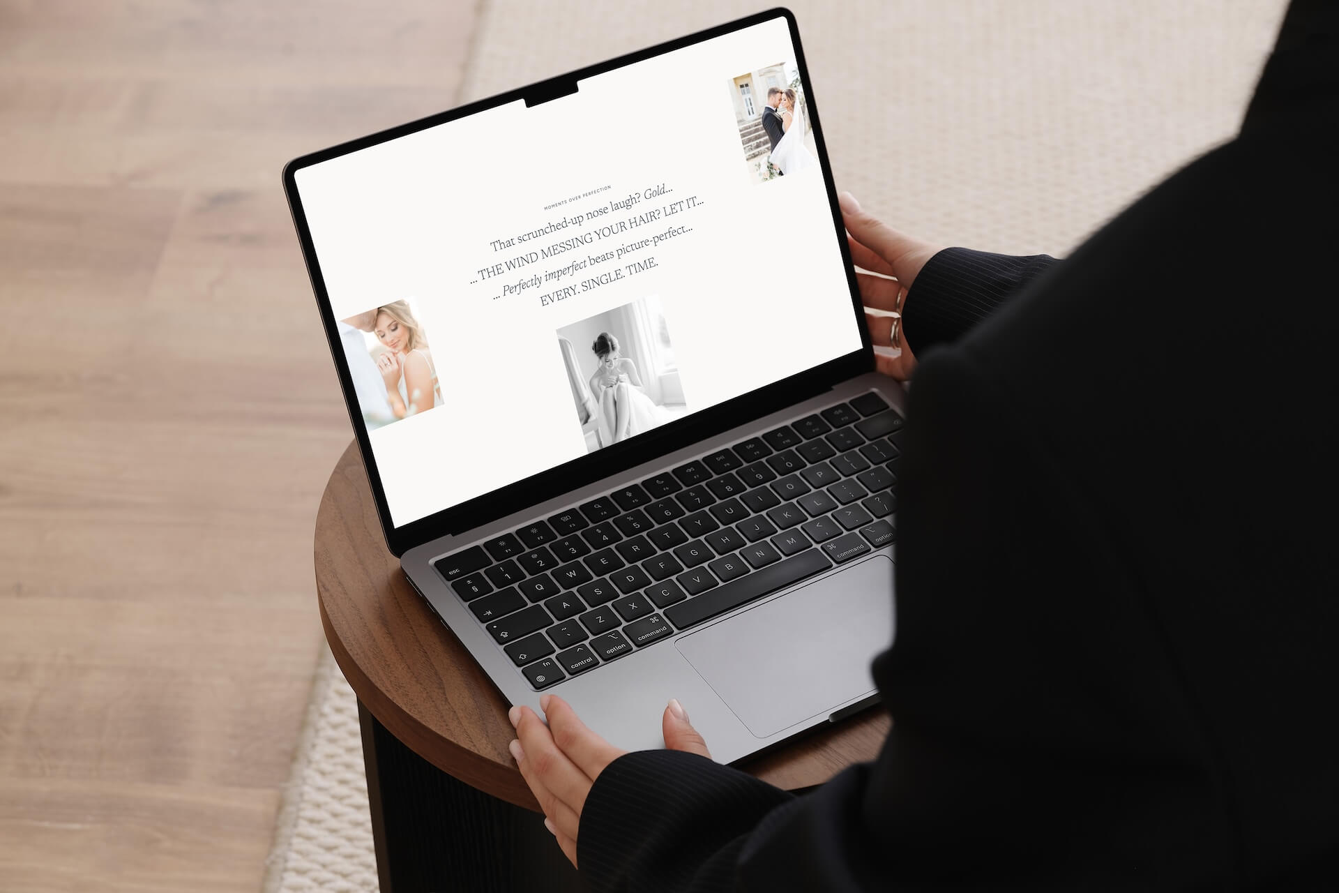
Section One: The Hero
The hero is the first thing someone sees when they land on your page. It has one job: make sure the right person immediately knows they’re in the right place.
This is where so many professional photography websites lose people. The hero becomes a beautiful, poetic headline with no real direction—something like “Capturing love in every frame”—which tells a visitor almost nothing about whether you’re the photographer for them, where you’re based, or what to do next.
Clarity first, then personality.
{And side note: If you want your positioning to be premium, I don’t recommend generic phrases like “Capturing love in every frame” because that could be for any photographer. What makes you, you?}
I did this on my own site for longer than I’d like to admit. I thought a dreamy headline made me sound more like a photographer and less stuffy and corporate. What it actually did was leave people guessing, and {as you should know by now} people who are guessing tend to leave.
A hero that books says what you do, who you do it for, and points toward the next step. Be specific—your location, the type of photography you specialise in, and exactly who you serve.
This isn’t just good for connection and letting your audience know they’re in the right {or wrong} place, it’s also good for SEO and helps people find you in Google searches.
Then a clear button {CTA} to the one thing you most want visitors to do, whether that’s viewing your packages, reading more, or getting in touch.
And all of this should be above the fold so it’s the first thing they see.
“Above the fold” is a term borrowed from newspaper printing, where the most important story always appeared on the top half of the front page before it was folded.
On a website, it’s everything visible before you scroll. Placing your most important call to action there means every single visitor sees it, whether they read the rest of the page or not.
Eye-tracking research from Missouri University of Science and Technology found that visitors spend 2.6 seconds on a page’s main image before deciding whether to stay {data by sciencedaily.com}, so your hero needs to use those seconds well!
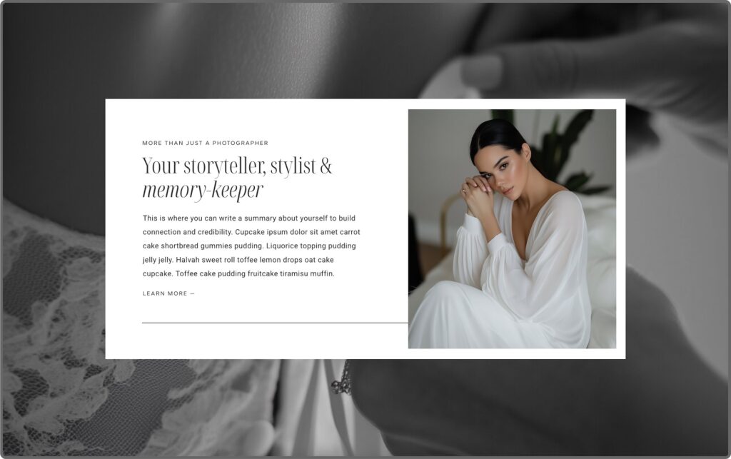
Section Two: The Connection
Once someone knows they’re in the right place, they need to feel understood, and they need to see who they’re actually talking to.
Including a photo of yourself here is more important than most photographers realise. People book people. Couples want to know who’s going to be with them on their wedding day, and a face changes the dynamic of a page completely.
It shifts you from a service to a person. A warm, natural image of you {not a stiff headshot, something that actually feels like you} gives visitors a reason to connect before they’ve even read your words.
This section should lead with empathy and showing them you understand them—it’s not a space for your bio.
Although this is technically an “about me” section, it’s really about them.
Reflecting back what your dream clients are actually feeling—something like acknowledging that they’ve been planning this day for a long time, that they want it captured in a way that actually feels like them, that they’re looking for someone who just gets it—lands far better than a paragraph about how long you’ve been shooting.
Then you can anchor your credibility: how long you’ve been doing this, how many couples you’ve worked with, what makes your approach different.
When you look at your homepage right now, ask yourself honestly: does it lead with you, or does it lead with them?
Section Three: The Offerings
This is where visitors get a clear overview of what you actually do and whether you’re the right fit for them.
I wouldn’t add more than three as you don’t want to overwhelm them, and they should only be your top services. Not every package or add-on, just the main services that you want to be known for.
Each one should link straight through to its own services page, so someone who knows what they’re looking for can get there quickly without having to hunt for it.
If you only offer one thing {e.g. weddings} use this space to speak directly to that, and lead them to your weddings services page.
A lot of photographer homepages I review show every package on their homepage—full day, half day, elopement, portrait session, etc—all sitting side by side with equal weight. The visitor has to do the work of figuring out which one applies to them, and a lot of them won’t bother.
A focused selection does that work for them. {And remember, it’s your job to make it as easy as possible for them to book you}.
Section Four: Social Proof
A lot of photographers keep all their testimonials on one dedicated page of their website. The problem with that is most visitors never make it there.
Visitors who see testimonials convert at a rate 161% higher than those who don’t {data by yotpo.com}, so it’s worth making sure they actually see them by sprinkling social proof throughout your homepage.
They build trust that helps guide them through the whole experience—and when a visitor is on the verge of hesitating, a quote can nudge them forward.
Keep them short and results-focused. The transformation matters the most.
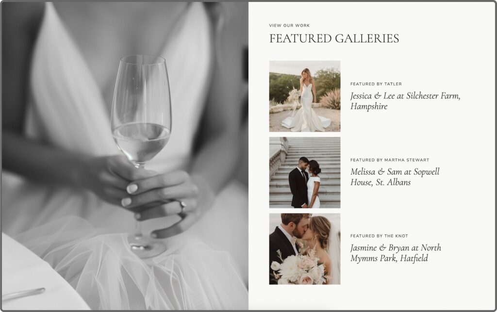
Section Five: The Portfolio Overview
Your portfolio overview doesn’t need to be a long, scrolling section of images. Ideally, they should link to three to four curated client galleries from your portfolio so your audience can click through and see the experience as a whole {which helps them see themselves working with you and what you can do for them}.
But it’s important to feature the right galleries—the types of work you want more of, because that’s what it will attract.
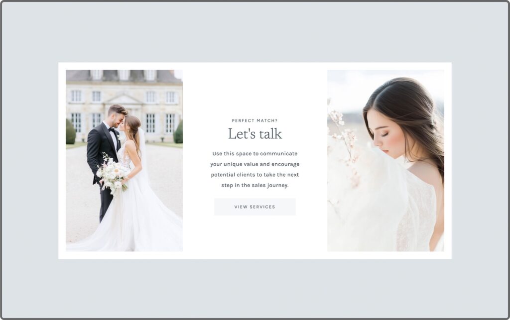
Section Six: The Closing CTA
So many photography websites just… stop.
You scroll to the bottom and you’re met with a footer. For someone who’s made it all the way down the page and is genuinely interested, that’s a disappointing end to what could have been a really good first impression. And it causes friction because you haven’t told them the next step, so they have to try to figure it out themselves.
I know it sounds small and picky, but it’s the type of homepage mistake that can put off a potential client.
Your closing CTA {call-to-action} is your last chance to invite someone in. It should point clearly to the single most important next step you want them to take.
Not three options or a general “get in touch”—one thing that makes it easy for the right person to say yes.
The order matters as much as the sections
Looking at professional photography website examples that actually convert, one thing is consistent: the sections follow a deliberate sequence:
- Clarity
- Connection
- Direction
- Testimonials
- Curated Portfolio
- Invitation
Website Homepage Checklist:
When visitors feel guided through a page rather than left to figure it out, they stay longer, trust faster, and enquire more. Run this quick audit on your own homepage:
- Is it immediately clear what you do and who you photograph?
- Is there a CTA visible before anyone has to scroll?
- Is there a photo of you towards the top-middle?
- Is your navigation clean, with no more than six links?
- Does social proof appear in more than one place on the page?
- Does the portfolio feel curated, not just a wall of images?
- Does the page end with one clear invitation?
If you want a deeper look at where your website might be losing bookings before visitors even get this far, my free guide—5 Website Mistakes Costing You High-End Bookings—covers the most common ones I see across photographer websites, and it’s a great place to start.
Want the strategy already built into your website design?
If you’re building or overhauling your photography website and you want this structure already in the design from day one, that’s exactly what the EverBooked Showit templates are built around.
Every template follows this homepage structure, built to guide visitors through those questions they want answered most and guide them towards enquiry. And because they’re built on Showit*, the whole thing is fully customisable without code.
Each template also includes the Accelerated Launch Roadmap and 5-Day Launch Series, so you get the strategy and the support with the design, and without the overwhelm or procrastination.
Explore the Showit templates →
Some links in this post are affiliate links, which means I may earn a small commission if you purchase through them, at no extra cost to you. I only ever recommend tools I genuinely use and love.


